Welcome to My Media blog

In this blog, I will be explaining how and why I created my A2 Media Coursework, showing some research and screenshots from the design phase.
This will be justified with my initial ideas and inspirations from other newspapers, as well as feed back from peers and a self evaluation of my work.

Wednesday, 29 December 2010

Creating the second page of the Newspaper

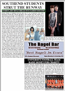
I started to look at the inside/second pages of local newspapers. Normally the stories that are still impressive stories will be here as they didnt quite make the cover. I am going to run 2 stories on this page, one being a bigger feature taking up most of the space. I will then again use adverts for local attractions to fill the space and make the page look more attractive.
The main story of this page is actually a true one about a friend of mine, whom was a student and made it in the fashion industry. I am going to use my own pictures to back up the story and re-tell his story in my own words.
I played around with the headline and main picture, as well as the text until I settles with this layout.
I chose to use the main headline as black text on the white background of the page, as this is typical for a headline inside the paper. I then created a subheading in a black text box with white text to give a further lead into the story.
As I am trying to keep my paper relitivel simple in its layout, I decided to even out the space and add another picture to the story as well as some information under the main photo. I then wanted to make a clean divide in the page in order to make the next story place neatly in the area underneath, so I created an advert for a 'Bagel Bar' in Photoshop.
This gave the page a clean 'cut' in half and enabled me to fill the bottom section in a similar fashion, giving me a decent amount of space for another story whilst still looking neat.
The next story I decided to write was that about a University football team. This kept with the local spirit of the paper and featured a subject of sport which is popular amonsgt the target audience.
I created my story in the space available and came out with the finished layout as so-


I chose to use a black heading with white font as it is a smaller headline and this helps it to stand out from the rest of the text on the page without being too large. The story itself is not very long due to the space but it works very well alongside a picture of my local football team. I made this to fit directly underneath the 'Bagel Bar' advert which again makes the layout look very precise and as a  real paper would.

This meant there was only a small space to the left of the football story empty on my page.

I decided to fill this with an advert, this time one for a local shop. Again I created this on Photoshop, and used a picture of my friend in one of her modelling shoots to make it look as though a model is advertising the clothes.


I used some effects in the font in order to make the advert stand out as well as making the text readable on the bright background of the photo. After I placed the advert in position, my second page started to look like this-
 I then added the bottom strapline to the page in order to match it to the front page, and numbered it appropriatley.

This gave my paper a complete and finished look. All the space availalable on the page had been used and to the best effectivness. When I create the website for the newspaper, I will use theses same stories and information in a different format.

Sunday, 26 December 2010

Creating the Newspaper Front Cover

To begin with I started to look at local newspapers and how they are set out.
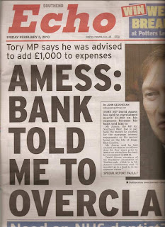
It became apparent that the masthead is normally placed in the top left hand corner, like so.
After initially naming the paper and creating a masthead, I edited it appropriately for the newspaper, adding the issue date and price underneath, with a tag line.
I decided I wanted the paper to be issued monthly as there may not be enough news for that particular target audience to be updated daily or weekly, and being a monthly paper can ensure a good copy with plenty of information is produced.
Students also may not want to spend the money buying a paper everyday, and it makes the issue available for a longer period of time.


I then started to create stories and adverts for my paper. I again thought about the target audience and what sort of adverts they would like to see, and decided to put a small advert box stretching underneath the masthead. I created an advert in Photoshop and moved it into Indesign once I was happy with it.


Once placed underneath the masthead, it looked like this.


I had spent some time thinking of realistic stories I could use for my paper, backed up by images I could take myself. I decided to use a story about a new campus being built for the local University, and to take pictures of a local derelict car park to justify it. After trying many layouts I finalised with this one.

I used the headline in white font on a black background to make it stand out, and then underneath the picture a smaller sub headline to further grasp the readers attention. I also used an inserted text box of a different colour, made to be eye catching. In this I used a quote from the story given by a reliable source.

Under this along the bottom of the page, a small amount of space needed to be filled. I looked at newspapers I have at home, and noticed this is normally filled by adverts or earpieces to entice the reader. Local newspapers often encourage readers to share their local stories and information, so I decided to create an advert for this, and another for a local hairdressers.


There was also the long column of space running down the right side of the paper still empty. I decided to create an advert for a clinic to fill the top right corner. I wanted to use an advert in the earpiece as this is a good place for readers to notice an advertisement or story lead. For this advert along with the other adverts, I can re edit them and use them for the newspapers website.


Along with other adverts and a small side story I created to fill space, my cover started to look like this-


 I then used a story about a student winning an art competition and used a photo of my friends art coursework to create a sub story on the front cover.I started to evaluate my piece at this late stage, and decided it was missing something every newspaper has, a bottom footer, normally with the name, website name and page number on it.


I decided to add this, and this would be the same for numbering all the following pages.

Continuing in evaluating my paper, I realised that the name of the newspapers website is no where to be seen on the paper, so I needed to add this. The website name is normally shown just under the masthead on the front page, so I went back and edited my masthead to incorporate the site address.