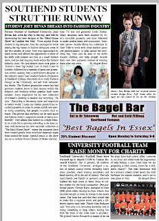
I feel that my product developed, used and challenged the forms and conventions of real media products. Through my research phase I picked the key conventions of my products and ensured that I included them within my products. Looking back at my newspaper product, even though it is quite simple in layout and design, this is what I was aiming for as this is how a real newspaper would look. My product developed as I asked people for feedback combined with the information that I had gained through the research phase and put these ideas and changes into place.
The combination of the main task along with the ancillary tasks compliment each other as my ancillary task is an advert for my newspaper, so I used features of my magazine to create the advert and represent it in a different medium. This is also the same for the website as I based the layout and design on the the print newspaper, in order to create an online version of the paper itself.
I learnt from my audience feedback as my peers helped me to create and improve my advert, newspaper and website. My most valuable feedback was from my brother whom recommended that I make the text of the stories on my newspaper 'fully justified' rather than aligned to the right. This small change completely changed the look of my paper and made the columns look neater and more like an actually newspaper. I also asked my peers if they felt the advertisments I had used were appropraite and they said they were adverts that students and teenagers would benifit from being about local shops, food places and health centers.
Different media technologies helped me in my construction and research of the product, including the internet, digital media and publishing software.
A2 Media Research
Welcome to My Media blog
In this blog, I will be explaining how and why I created my A2 Media Coursework, showing some research and screenshots from the design phase.
This will be justified with my initial ideas and inspirations from other newspapers, as well as feed back from peers and a self evaluation of my work.
This will be justified with my initial ideas and inspirations from other newspapers, as well as feed back from peers and a self evaluation of my work.
Friday, 6 May 2011
Friday, 25 February 2011
Creating The Advert
Part of our task was to create a print advert for our newspaper. This gave many options including a magazine advert, bus stop advert, billboard advert, flier and many more. After much thought, I decided to do a Bus Advert, an advert which is seen on the side, back or front of a bus. I chose this because I think this is an effective way of advertising, as personally I always notice bus advertisements, whether I am driving, walking or somewhere around town.
Bus adverts need to be relatively simple, as they are meant to be seen by drivers or passers by whom do not having long to focus on the moving vehicle. I want my newspaper advert to work on the principle of advertising the name of the paper, and making it be seen by as many people as possible, rather than to promote the product being the newspaper itself. This helps to make the product name/brand well known and popular and many company's use this type of advertising as it works effectively in making their brand well known. This can also be seen in slightly different forms including sponsoring, where a company pays to have its name put onto other products, people or events.
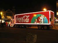 A prime example of this is the company 'Coca-Cola', whom advertise their name, rather than their actual products. They are renowned for their annual Christmas adverts, which do not necessarily make the viewer want to purchase one of their products, as the adverts are often irrelevant to the product, but they succeed in making the brand itself extremely popular.
 Before I started designing my bus advert, I had to find the dimensions used for a bus advert, and then scale it appropriately for design in Photoshop. I used the Internet to help me find the following information -
I then started to design my advert, and decided to use the paper's name as the main focus of the advert, just as Coca Cola do. I wanted to use the masthead from the paper, making it a logo for the company of sorts, as I have also used it for the paper's website. This also ensures that drivers and passers by will recognize the name or logo for the paper.
I then wanted to add some simple information, the web address for the papers website and a tag line. This would show the audience how to gain information on the company and it's newspaper.
I wanted to keep the advert very simple for the reasons I have stated above, so just added the web address along with a small line of information to tell people what the paper is 'Essex student information guide', as well as 'issued monthly' to inform the target audience of availability.
I felt a small change needed to be made to the masthead to make it more eye catching and slightly different to what was on the paper itself, so I thought about simple ways of doing this and decided adding a picture of a student would not only show the genre of the paper on first glance, but would also be more eye catching to students themselves. The obvious place to put this was in the center of the 'Q' in Unique, so I tried this out.
I took a picture from my cousins graduation, and edited it to fit in the space in the center of the 'Q'. I used a shadow effect with the matching tones of red and grey from the masthead to make it match the rest of the advert.
This fitted well and looked very effective, so I continued to edit the photo into the masthead, and the final advert came out looking like this -
Given the space available for the bus advert, I feel I used this very effectively. After showing some of my peers, my feedback was positive, after they recognized that bus adverts are made to be simple and this showed the name of the paper large and clear. Advertising a newspaper can be difficult as the product itself changes every issue, only certain features stay the same, the masthead being one of them. The advert also effectively promotes the papers website, which runs alongside the print issue.
To get a real feel of how my advert would look on the back of a bus, I used my photoshop skills to create a replica photo -
I feel this looks very effective and does the exact form of advertising I wanted it to. It looks professional and simple on the back of the bus and promotes the paper well by having the masthead literally plastered across the back of the bus, helping making the paper's masthead a recognized and well known logo locally.
Bus adverts need to be relatively simple, as they are meant to be seen by drivers or passers by whom do not having long to focus on the moving vehicle. I want my newspaper advert to work on the principle of advertising the name of the paper, and making it be seen by as many people as possible, rather than to promote the product being the newspaper itself. This helps to make the product name/brand well known and popular and many company's use this type of advertising as it works effectively in making their brand well known. This can also be seen in slightly different forms including sponsoring, where a company pays to have its name put onto other products, people or events.
 A prime example of this is the company 'Coca-Cola', whom advertise their name, rather than their actual products. They are renowned for their annual Christmas adverts, which do not necessarily make the viewer want to purchase one of their products, as the adverts are often irrelevant to the product, but they succeed in making the brand itself extremely popular.
 Before I started designing my bus advert, I had to find the dimensions used for a bus advert, and then scale it appropriately for design in Photoshop. I used the Internet to help me find the following information -
I then started to design my advert, and decided to use the paper's name as the main focus of the advert, just as Coca Cola do. I wanted to use the masthead from the paper, making it a logo for the company of sorts, as I have also used it for the paper's website. This also ensures that drivers and passers by will recognize the name or logo for the paper.
I then wanted to add some simple information, the web address for the papers website and a tag line. This would show the audience how to gain information on the company and it's newspaper.
I wanted to keep the advert very simple for the reasons I have stated above, so just added the web address along with a small line of information to tell people what the paper is 'Essex student information guide', as well as 'issued monthly' to inform the target audience of availability.
I felt a small change needed to be made to the masthead to make it more eye catching and slightly different to what was on the paper itself, so I thought about simple ways of doing this and decided adding a picture of a student would not only show the genre of the paper on first glance, but would also be more eye catching to students themselves. The obvious place to put this was in the center of the 'Q' in Unique, so I tried this out.
I took a picture from my cousins graduation, and edited it to fit in the space in the center of the 'Q'. I used a shadow effect with the matching tones of red and grey from the masthead to make it match the rest of the advert.
This fitted well and looked very effective, so I continued to edit the photo into the masthead, and the final advert came out looking like this -
Given the space available for the bus advert, I feel I used this very effectively. After showing some of my peers, my feedback was positive, after they recognized that bus adverts are made to be simple and this showed the name of the paper large and clear. Advertising a newspaper can be difficult as the product itself changes every issue, only certain features stay the same, the masthead being one of them. The advert also effectively promotes the papers website, which runs alongside the print issue.
To get a real feel of how my advert would look on the back of a bus, I used my photoshop skills to create a replica photo -
I feel this looks very effective and does the exact form of advertising I wanted it to. It looks professional and simple on the back of the bus and promotes the paper well by having the masthead literally plastered across the back of the bus, helping making the paper's masthead a recognized and well known logo locally.
Wednesday, 5 January 2011
Creating the Linked Page of the Website
The linked page of the website is relatively easy to create as the template of the page itself has already been created, as it is the same as the the home page. This page will be the linked page from the button 'Top Stories', and will include a story from the newspaper. I have chosen to do the fashion story for my linked page, as I have already written the large amount of text for the story, and it would be the same text as in the newspaper itself.
As you can see I started by adding the headline and photos which were the same as the print version of the story. I placed them where I felt appropriate and where I knew it would leave enough space available for the text of the story itself.I also added an extra button to this page, which enables the viewer to navigate back to the page they were previously viewing. This also works as a rollover and changes colour when the mouse hits it, like so-
The page started to look like this once I had started to add the story itself, which conveniently fitted into the space perfectly.
I liked how the page looked as it was exactly what I aimed for, to look just like an online newspaper, and show key similarities to a print paper, which it does. I continued to tweak the layout and tried some other font styles but settles for this one in the end, and my web page looked like this-
The home button linked directly back to the home web page, as well as the 'back to previous page' button.
Tuesday, 4 January 2011
Creating The Home Page of the Website
To start my website, I must firstly created the image of it on Photoshop. I will use guides in order to ensure the image can be sliced easily later on and put into Dreamweaver and made into an actual working website.
The starting point was the top of the web page, where the masthead and buttons would be.
I started by placing the masthead int he top left corner, and then thinking of what navigation buttons I would need for my site. I decided on a 'home' page, a 'top stories' page, 'your say', 'classified ads' and 'contact' page for the buttons to represent. As I am only creating one other linked page for my project I will have to decide what one I want to create.
The masthead will stretch across most of the top of the page leaving a small area empty in the right of the page. As this will be the same for every web page, I need to pick something that would be relevant on each one. I noticed during the research phase while looking at newspaper websites that some offer the viewer to read the print edition online. This meant subscribing or paying a small fee. I think this is a really attractive feature for a website, and also a potential money making device, so I am going to add this to my top left ear piece.
After tweaking with designing I ended up with this masthead and navigation area for my site-
I then started to turn the stories from the newspaper into leads for the website. The main story of my paper was the one about the new campus at the university. I wanted this one to be a large picture, with a headline and lead to make people want to click and read the full story.
I used white text with blending options and shadow effects to make it stand out. I also used a clipping mask on the photo to make it have rounded edges as this looked more pleasing to the eye. I will use this clipping mask throughout the webpages to keep the same style. The rollover will be the 'read more...' text. This will turn red when the mouse rolls over it. I did this by duplicating the layer and changing the colour of the text.
I used some bold text for the main part of the headline, and then a further line of information to attract attention. I plan to do toher stories like this to fill up the space with other story leads on my page. Here is what the story looked like once I included it in my page, and the rest of the available space. Here you can also see the guides and margins I have used to ensure my webpage is neat and laid out properly.
I plan to fill the rest of the space with similar leads to other stories and areas on the website. I created a similar lead to the story I used on the front cover of the paper, about the student winning the Art Competition and then filled the rest of the space with new other leads. My page started to look like this-
With the guides on I was happy that I had filled all of my space without making anything look too squashed or empty. The rollovers would be clear and there are many different areas and stories for a viewer to look at.With the guides off, my web page looked like this-
The starting point was the top of the web page, where the masthead and buttons would be.
I started by placing the masthead int he top left corner, and then thinking of what navigation buttons I would need for my site. I decided on a 'home' page, a 'top stories' page, 'your say', 'classified ads' and 'contact' page for the buttons to represent. As I am only creating one other linked page for my project I will have to decide what one I want to create.
The masthead will stretch across most of the top of the page leaving a small area empty in the right of the page. As this will be the same for every web page, I need to pick something that would be relevant on each one. I noticed during the research phase while looking at newspaper websites that some offer the viewer to read the print edition online. This meant subscribing or paying a small fee. I think this is a really attractive feature for a website, and also a potential money making device, so I am going to add this to my top left ear piece.
After tweaking with designing I ended up with this masthead and navigation area for my site-
I have kept the area quite simple so that is is clear and easy to use. The button to read the print edition is large and in the same red colour used for the 'Q' in the masthead, so it coordinates nicely. I will the theme of colours of red grey and white used in the masthead as the main colours used throughout the web pages and used the rollovers.
I also wanted other aspects of the website to be similar to the print newspaper itself, so that the viewer recognises and has the sense of reading the paper even though its on the website, so I am also going to add two features along the bottom of the page that will stay the same on every linked other linked page.
Thishas created a 'template' for all of the web pages. I edited the 'clinic' advert from the newspaper and made it suitable to fit the web page. I also included the advert that encourages readers to share their stories online.I then started to turn the stories from the newspaper into leads for the website. The main story of my paper was the one about the new campus at the university. I wanted this one to be a large picture, with a headline and lead to make people want to click and read the full story.
I used white text with blending options and shadow effects to make it stand out. I also used a clipping mask on the photo to make it have rounded edges as this looked more pleasing to the eye. I will use this clipping mask throughout the webpages to keep the same style. The rollover will be the 'read more...' text. This will turn red when the mouse rolls over it. I did this by duplicating the layer and changing the colour of the text.
I then did the same for the fashion story which was featured on the second page of the newspaper.
Again I have stayed with the white text, which works well as the background of the picture is so dark. The rollover is the same as the last one, and turns red over 'read more...'. I also used the same clipping mask, this worked well on the dark photo. I placed both stoires onto the page and the layout started to grow-
This showed the reamining available space in which I had left to work. I wanted to make small box like leads to storys as I saw on other websites in the research phase. I decided to start this by turning the football team story into a lead like this. This would mean using the picture along with the headline or just one or two lines of text to make the reader want to click and read more. I played around with a few designs, and liked this one-I used some bold text for the main part of the headline, and then a further line of information to attract attention. I plan to do toher stories like this to fill up the space with other story leads on my page. Here is what the story looked like once I included it in my page, and the rest of the available space. Here you can also see the guides and margins I have used to ensure my webpage is neat and laid out properly.
I plan to fill the rest of the space with similar leads to other stories and areas on the website. I created a similar lead to the story I used on the front cover of the paper, about the student winning the Art Competition and then filled the rest of the space with new other leads. My page started to look like this-
With the guides on I was happy that I had filled all of my space without making anything look too squashed or empty. The rollovers would be clear and there are many different areas and stories for a viewer to look at.With the guides off, my web page looked like this-
Monday, 3 January 2011
Researching the Website
I stared researching websites for newspapers and magazines. I had a look at some examples on the internet for both local and national newspapers. Here are some of the websites I used for research:
http://www.echo-news.co.uk/
http://www.dailymail.co.uk/home/index.html
http://www.standardmedia.co.ke/
http://www.dailystar.co.uk/home/
Newspaper websites seem to work in a simple format, often mimicking an actual newspaper, with a white background and a masthead at the top.
Just as the actual paper, the red-top masthead is again in the top left corner. This area along with the buttons to navigat around the website stay the same throughout each page on the website.
The stories and headlines would be the same for the printpaper that day, and some of the adverts featured would also have been edited for the online paper. Here is another example of a website for a newspaper, this time for the 'Daily Mail'
The masthead for this paper has been slightly changed from that of the print paper. The font and text of the word 'mail' is the same, but they have changed the name to 'Mail Online'.
Again for this site the masthead and buttons and whole top area of the paper stay the same as you navigate through the site.
The stories themselves arent set out like in the print edition. The main headlines and stories are all shown on the front page, but normally with just a headline and picture, and maybe a small lead of rollover information taking you to the complete story on another page.
As you can see on the right hand side of the site above, a similar box layout showing a small picture and small paragraph of info is shown to entise people to read some of the smaller stories.
The sites seem slightly more colourful than the print versions themselves, along with the changing of colours used with the rollovers for linked pages. I will try to incoorporate all of these key features into my website in order for it to be realistic and easy to navigate around.
Wednesday, 29 December 2010
Creating the second page of the Newspaper
I started to look at the inside/second pages of local newspapers. Normally the stories that are still impressive stories will be here as they didnt quite make the cover. I am going to run 2 stories on this page, one being a bigger feature taking up most of the space. I will then again use adverts for local attractions to fill the space and make the page look more attractive.
The main story of this page is actually a true one about a friend of mine, whom was a student and made it in the fashion industry. I am going to use my own pictures to back up the story and re-tell his story in my own words.
I played around with the headline and main picture, as well as the text until I settles with this layout.
This meant there was only a small space to the left of the football story empty on my page.
The main story of this page is actually a true one about a friend of mine, whom was a student and made it in the fashion industry. I am going to use my own pictures to back up the story and re-tell his story in my own words.
I played around with the headline and main picture, as well as the text until I settles with this layout.
I chose to use the main headline as black text on the white background of the page, as this is typical for a headline inside the paper. I then created a subheading in a black text box with white text to give a further lead into the story.
As I am trying to keep my paper relitivel simple in its layout, I decided to even out the space and add another picture to the story as well as some information under the main photo. I then wanted to make a clean divide in the page in order to make the next story place neatly in the area underneath, so I created an advert for a 'Bagel Bar' in Photoshop.This gave the page a clean 'cut' in half and enabled me to fill the bottom section in a similar fashion, giving me a decent amount of space for another story whilst still looking neat.
The next story I decided to write was that about a University football team. This kept with the local spirit of the paper and featured a subject of sport which is popular amonsgt the target audience.
I created my story in the space available and came out with the finished layout as so-
I chose to use a black heading with white font as it is a smaller headline and this helps it to stand out from the rest of the text on the page without being too large. The story itself is not very long due to the space but it works very well alongside a picture of my local football team. I made this to fit directly underneath the 'Bagel Bar' advert which again makes the layout look very precise and as a real paper would.
This meant there was only a small space to the left of the football story empty on my page.
I decided to fill this with an advert, this time one for a local shop. Again I created this on Photoshop, and used a picture of my friend in one of her modelling shoots to make it look as though a model is advertising the clothes.
I used some effects in the font in order to make the advert stand out as well as making the text readable on the bright background of the photo. After I placed the advert in position, my second page started to look like this-
I then added the bottom strapline to the page in order to match it to the front page, and numbered it appropriatley.
This gave my paper a complete and finished look. All the space availalable on the page had been used and to the best effectivness. When I create the website for the newspaper, I will use theses same stories and information in a different format.
Sunday, 26 December 2010
Creating the Newspaper Front Cover
To begin with I started to look at local newspapers and how they are set out.
It became apparent that the masthead is normally placed in the top left hand corner, like so.
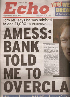 After initially naming the paper and creating a masthead, I edited it appropriately for the newspaper, adding the issue date and price underneath, with a tag line.
I decided I wanted the paper to be issued monthly as there may not be enough news for that particular target audience to be updated daily or weekly, and being a monthly paper can ensure a good copy with plenty of information is produced.
Students also may not want to spend the money buying a paper everyday, and it makes the issue available for a longer period of time.
 I then started to create stories and adverts for my paper. I again thought about the target audience and what sort of adverts they would like to see, and decided to put a small advert box stretching underneath the masthead. I created an advert in Photoshop and moved it into Indesign once I was happy with it.
Once placed underneath the masthead, it looked like this.

I had spent some time thinking of realistic stories I could use for my paper, backed up by images I could take myself. I decided to use a story about a new campus being built for the local University, and to take pictures of a local derelict car park to justify it. After trying many layouts I finalised with this one.
I used the headline in white font on a black background to make it stand out, and then underneath the picture a smaller sub headline to further grasp the readers attention. I also used an inserted text box of a different colour, made to be eye catching. In this I used a quote from the story given by a reliable source.
Under this along the bottom of the page, a small amount of space needed to be filled. I looked at newspapers I have at home, and noticed this is normally filled by adverts or earpieces to entice the reader. Local newspapers often encourage readers to share their local stories and information, so I decided to create an advert for this, and another for a local hairdressers.
There was also the long column of space running down the right side of the paper still empty. I decided to create an advert for a clinic to fill the top right corner. I wanted to use an advert in the earpiece as this is a good place for readers to notice an advertisement or story lead. For this advert along with the other adverts, I can re edit them and use them for the newspapers website.
Along with other adverts and a small side story I created to fill space, my cover started to look like this-
I then used a story about a student winning an art competition and used a photo of my friends art coursework to create a sub story on the front cover.I started to evaluate my piece at this late stage, and decided it was missing something every newspaper has, a bottom footer, normally with the name, website name and page number on it.
I decided to add this, and this would be the same for numbering all the following pages.
Continuing in evaluating my paper, I realised that the name of the newspapers website is no where to be seen on the paper, so I needed to add this. The website name is normally shown just under the masthead on the front page, so I went back and edited my masthead to incorporate the site address.
It became apparent that the masthead is normally placed in the top left hand corner, like so.
 After initially naming the paper and creating a masthead, I edited it appropriately for the newspaper, adding the issue date and price underneath, with a tag line.
I decided I wanted the paper to be issued monthly as there may not be enough news for that particular target audience to be updated daily or weekly, and being a monthly paper can ensure a good copy with plenty of information is produced.
Students also may not want to spend the money buying a paper everyday, and it makes the issue available for a longer period of time.
 I then started to create stories and adverts for my paper. I again thought about the target audience and what sort of adverts they would like to see, and decided to put a small advert box stretching underneath the masthead. I created an advert in Photoshop and moved it into Indesign once I was happy with it.
Once placed underneath the masthead, it looked like this.

I had spent some time thinking of realistic stories I could use for my paper, backed up by images I could take myself. I decided to use a story about a new campus being built for the local University, and to take pictures of a local derelict car park to justify it. After trying many layouts I finalised with this one.
I used the headline in white font on a black background to make it stand out, and then underneath the picture a smaller sub headline to further grasp the readers attention. I also used an inserted text box of a different colour, made to be eye catching. In this I used a quote from the story given by a reliable source.
Under this along the bottom of the page, a small amount of space needed to be filled. I looked at newspapers I have at home, and noticed this is normally filled by adverts or earpieces to entice the reader. Local newspapers often encourage readers to share their local stories and information, so I decided to create an advert for this, and another for a local hairdressers.
There was also the long column of space running down the right side of the paper still empty. I decided to create an advert for a clinic to fill the top right corner. I wanted to use an advert in the earpiece as this is a good place for readers to notice an advertisement or story lead. For this advert along with the other adverts, I can re edit them and use them for the newspapers website.
Along with other adverts and a small side story I created to fill space, my cover started to look like this-
I then used a story about a student winning an art competition and used a photo of my friends art coursework to create a sub story on the front cover.I started to evaluate my piece at this late stage, and decided it was missing something every newspaper has, a bottom footer, normally with the name, website name and page number on it.
I decided to add this, and this would be the same for numbering all the following pages.
Continuing in evaluating my paper, I realised that the name of the newspapers website is no where to be seen on the paper, so I needed to add this. The website name is normally shown just under the masthead on the front page, so I went back and edited my masthead to incorporate the site address.
Subscribe to:
Comments (Atom)


