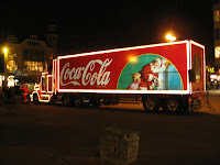
Bus adverts need to be relatively simple, as they are meant to be seen by drivers or passers by whom do not having long to focus on the moving vehicle. I want my newspaper advert to work on the principle of advertising the name of the paper, and making it be seen by as many people as possible, rather than to promote the product being the newspaper itself. This helps to make the product name/brand well known and popular and many company's use this type of advertising as it works effectively in making their brand well known. This can also be seen in slightly different forms including sponsoring, where a company pays to have its name put onto other products, people or events.
 A prime example of this is the company 'Coca-Cola', whom advertise their name, rather than their actual products. They are renowned for their annual Christmas adverts, which do not necessarily make the viewer want to purchase one of their products, as the adverts are often irrelevant to the product, but they succeed in making the brand itself extremely popular.
 Before I started designing my bus advert, I had to find the dimensions used for a bus advert, and then scale it appropriately for design in Photoshop. I used the Internet to help me find the following information -
I then started to design my advert, and decided to use the paper's name as the main focus of the advert, just as Coca Cola do. I wanted to use the masthead from the paper, making it a logo for the company of sorts, as I have also used it for the paper's website. This also ensures that drivers and passers by will recognize the name or logo for the paper.
I then wanted to add some simple information, the web address for the papers website and a tag line. This would show the audience how to gain information on the company and it's newspaper.
I wanted to keep the advert very simple for the reasons I have stated above, so just added the web address along with a small line of information to tell people what the paper is 'Essex student information guide', as well as 'issued monthly' to inform the target audience of availability.
I felt a small change needed to be made to the masthead to make it more eye catching and slightly different to what was on the paper itself, so I thought about simple ways of doing this and decided adding a picture of a student would not only show the genre of the paper on first glance, but would also be more eye catching to students themselves. The obvious place to put this was in the center of the 'Q' in Unique, so I tried this out.
I took a picture from my cousins graduation, and edited it to fit in the space in the center of the 'Q'. I used a shadow effect with the matching tones of red and grey from the masthead to make it match the rest of the advert.
This fitted well and looked very effective, so I continued to edit the photo into the masthead, and the final advert came out looking like this -
Given the space available for the bus advert, I feel I used this very effectively. After showing some of my peers, my feedback was positive, after they recognized that bus adverts are made to be simple and this showed the name of the paper large and clear. Advertising a newspaper can be difficult as the product itself changes every issue, only certain features stay the same, the masthead being one of them. The advert also effectively promotes the papers website, which runs alongside the print issue.
To get a real feel of how my advert would look on the back of a bus, I used my photoshop skills to create a replica photo -
I feel this looks very effective and does the exact form of advertising I wanted it to. It looks professional and simple on the back of the bus and promotes the paper well by having the masthead literally plastered across the back of the bus, helping making the paper's masthead a recognized and well known logo locally.


No comments:
Post a Comment